Exploratory Data Analysis with Seaborn (with a focus on data visualization) - Section 1
By Jia Liu in python data visualization EDA Seaborn
January 19, 2022
So why are we here?
Recently I’ve been using python more often in my work. I started to learn about Seaborn, which is a python visualization package built based on Matplotlib. It generates pretty figures! So I plan to do some exploratory data analysis with a focus on visualization using Seaborn. The dataset we will be using is the
US health insurance dataset from Kaggle.
In this section, we will focus on
-
Visualizing the distribution of single variable
-
Continuous variable
-
Categorical variable
-
-
Visualizing the bivariate distribution
(Future improvement: Trouble shooting the figure size adjustment for python generated plots in Rmarkdown)
Prepare
We will first import packages that needed and set some basic parameters for figures:
import pandas as pd
import numpy as np
from matplotlib import pyplot as plt
import seaborn as sns

plt.rcParams['figure.figsize'] = [12, 4]
#plt.rcParams['font.size'] = 14
#plt.rcParams['font.weight'] = 'bold'
plt.style.use('seaborn-whitegrid')
Read in the insurance data:
df = pd.read_csv("insurance.csv")

print('\nNumber of rows and columns in the data set: ', df.shape)
##
## Number of rows and columns in the data set:  (1338, 7)
df.head()
##    age     sex     bmi  children smoker     region      charges
## 0   19  female  27.900         0    yes  southwest  16884.92400
## 1   18    male  33.770         1     no  southeast   1725.55230
## 2   28    male  33.000         3     no  southeast   4449.46200
## 3   33    male  22.705         0     no  northwest  21984.47061
## 4   32    male  28.880         0     no  northwest   3866.85520
This data set includes insurance information for \(1338\) subjects. This first \(6\) columns age, sex, bmi, children, smoker, region are dependent variables. We want to see how these \(6\) features would influence the \(7\)th column, charges of insurance.
Exploratory data analysis
Check for missing values
Check how many missing values each feature has by the code below:
df.isnull().sum().to_frame(name = 'sum')
##           sum
## age         0
## sex         0
## bmi         0
## children    0
## smoker      0
## region      0
## charges     0
This seems to be a quite clean data set. Let’s move on to the next step.
Visualizing distributions
Looking at a data set, the first thing we may want to check is the distribution of some specific features. Taking the insurance data set as an example, we may want to know how the insurance charges distribute, or what is the age distribution in this data set. Visualizing the distribution allows us to learn about what to expect for the given feature(s) or compare the distributions of different variables.
- Univariate distribution
1.1. Continuous variable
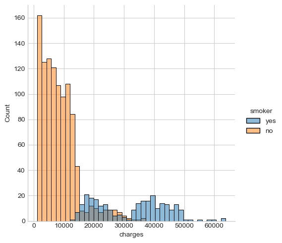
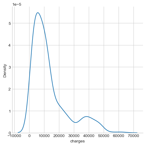
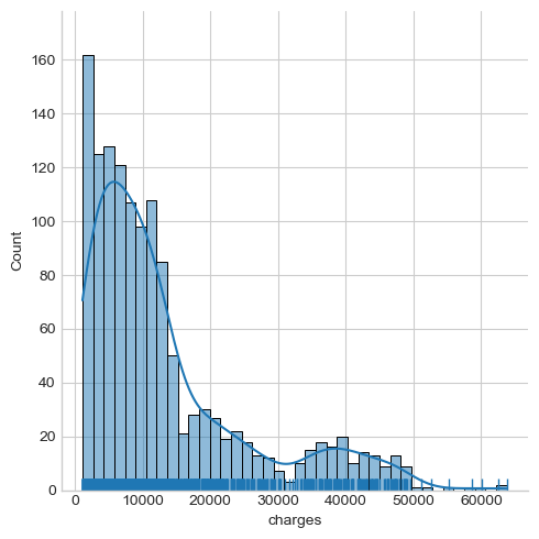
Histogram, KDE, ECDF plots are commonly used to display variable distributions, these plots can be performed by different settings of the displot() function in seaborn . Take the insurance charges as an example:
# Display the distribution of charges
sns.displot(x = 'charges', data = df, kind = 'hist', bins = 40, hue = 'smoker')
# KDE plot for charges
sns.displot(data = df, x = 'charges', kind = 'kde')
# Include the histogram, KDE, and rug on one plot
sns.displot(data = df, x = 'charges', kind = 'hist', kde = True, rug = True, bins = 40)
# ecdf of charges
sns.displot(data = df, x = 'charges', kind = 'ecdf', rug = True)
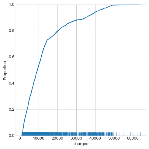
The insurance charges seem to follow a binormal distribution, where a large percentage of people being charged at less than \(20000\), a small group of people being charged at over \(30000\) or \(40000\).
1.2. Categorical variable
The counts of different values for a categorical variable can be displayed by countplot function. Let’s choose a categorical variable ‘region’ as an example:
# Display the counts distribution for different regions
sns.countplot(x = 'region', hue = 'smoker', data = df)
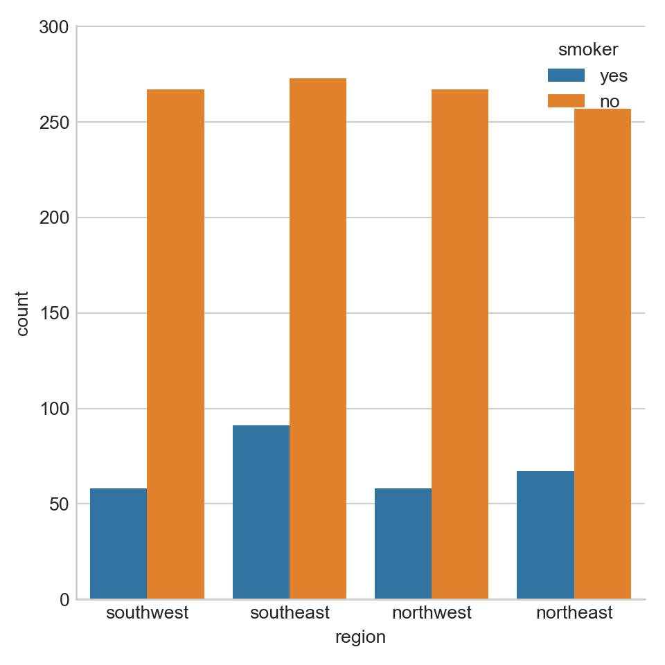
From the plot above we can tell that the number of subjects at different regions are roughly the same. At each region, there are much less subjects with the habit of smoking.
- Bivariate distribution
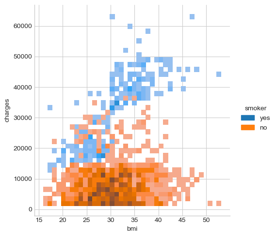
Histogram and KDE can also be used to show the data distributions based on two variables.
# Display the distribution data points over charges and bmi using histogram
sns.displot(y = 'charges', x = 'bmi', data = df, kind = 'hist', bins = 40, hue = 'smoker')
# Display the distribution data points over charges and bmi using kde
sns.displot(y = 'charges', x = 'bmi', data = df, kind = 'kde', hue = 'smoker')
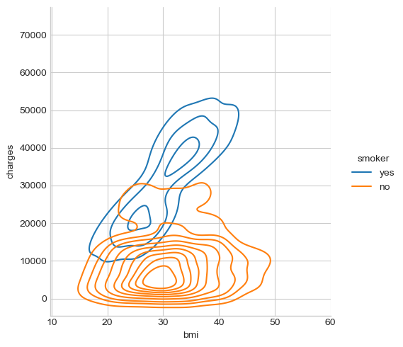
From the above plots we can see that the bmi of both smokers and non-smokers distribute around \((16, 50)\). For non-smokers, the insurance charges does not seem to be linearly correlated with bmi. But smokers with high bmi seem to be charged more in insurance.
- Posted on:
- January 19, 2022
- Length:
- 4 minute read, 747 words
- Categories:
- python data visualization EDA Seaborn
- See Also: