Exploratory Data Analysis with Seaborn (with a focus on data visualization) - Section 2
By Jia Liu in python data visualization EDA Seaborn
January 19, 2022
So why are we here?
Recently I’ve been using python more often in my work. I started to learn about Seaborn, which is a python visualization package built based on Matplotlib. It generates pretty figures! So I plan to do some exploratory data analysis with a focus on visualization using Seaborn. The dataset we will be using is the
US health insurance dataset from Kaggle.
In Section 1, we talked about how to display the distributions of univariate and bivariate variables.
In this section, we will focus on
-
Visualizing the relationships of two or more variables
-
Continuous variable Vs. Continuous variable
-
Continuous variable Vs.Categorical variable
-
We will also introduce the idea of object-oriented plotting.
Prepare
- Import packages that needed and set some basic parameters for figures:
import pandas as pd
import numpy as np
from matplotlib import pyplot as plt
import seaborn as sns

plt.rcParams['figure.figsize'] = [12, 4]
#plt.rcParams['font.size'] = 14
#plt.rcParams['font.weight'] = 'bold'
plt.style.use('seaborn-whitegrid')
- Read in the insurance data:
df = pd.read_csv("insurance.csv")

print('\nNumber of rows and columns in the data set: ', df.shape)
##
## Number of rows and columns in the data set:  (1338, 7)
df.head()
##    age     sex     bmi  children smoker     region      charges
## 0   19  female  27.900         0    yes  southwest  16884.92400
## 1   18    male  33.770         1     no  southeast   1725.55230
## 2   28    male  33.000         3     no  southeast   4449.46200
## 3   33    male  22.705         0     no  northwest  21984.47061
## 4   32    male  28.880         0     no  northwest   3866.85520
This data set includes insurance information for \(1338\) subjects. This first \(6\) columns age, sex, bmi, children, smoker, region are dependent variables. We want to see how these \(6\) features would influence the \(7\)th column, charges of insurance.
-
Object-oriented plotting: just like the object-oriented programming, we will create a figure object first, and then add more constructions or functions to it
-
Initiate a blank figure object
-
Add axes or subplot to the figure
-
Create plot(s) on the figure object
-
Adjust parameters to beautify the plot as needed
-
Exploratory data analysis
The data set is clean as we evaluated in the section 1 post.
Visualizing relationships of two or more variables
- Continuous variable Vs. Continuous variable
Scatter plot represent values of two numerical variables and shows the relationship of these variables:
# Scatter plot for Charges Vs. age and Charges Vs. bmi
## Create a blank figure object
f_scatter = plt.figure(figsize = (12, 4))
f_scatter.suptitle('Scatter plots')

## Add axes and plots to two scatter plots

# add axes and plot to figure 1
ax_scatter = f_scatter.add_subplot(121)
sns.scatterplot(x = df.age, y = df.charges, ax = ax_scatter, hue = df.smoker)
ax_scatter.set_title('Charges Vs. Age')
ax_scatter.set_xlabel('Age')
ax_scatter.set_ylabel('Charges')

# add axes and plot to figure 2
ax_scatter = f_scatter.add_subplot(122)
sns.scatterplot(x = df.bmi, y = df.charges, ax = ax_scatter, hue = df.smoker, palette = 'magma')
ax_scatter.set_title('Charge Vs. BMI')
ax_scatter.set_xlabel('BMI')
ax_scatter.set_ylabel('Charges')
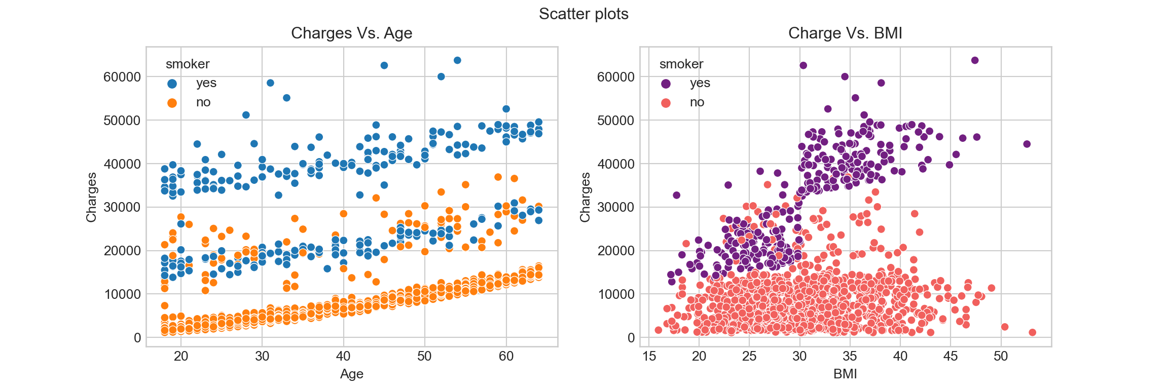
From the Charges Vs. Age figure we can tell that there are three main levels of insurance charges: high level are most smokers; medium level includes some smokers and some non-smokers; low level are non-smokers. The insurance charges at all of these three levels increase as the age increase.
The Charges Vs. BMI figure shows that BMI of both smokers and non-smokers distribute at around \((16, 50)\). While there insurance charges are relatively low for non-smokers, there is no obvious linear relationship between Charges for non-smokers and their BMI. For smokers, the insurance charge increase as BMI increase.
- Continuous variable Vs. Categorical variable
Sometimes we are interested in investigating how a continuous variable distribute at different levels of a categorical variable. In this part, we will talk about how to visualize this kind of relationships.
2.1. Line plot for time series data
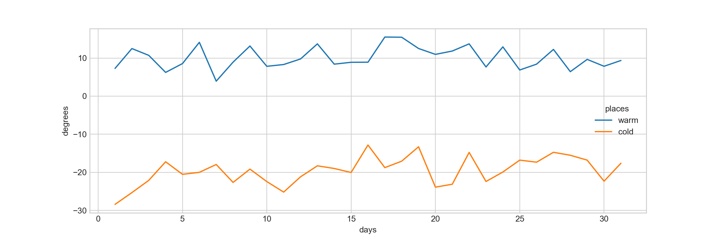
Time series data can be considered as a specific kind of categorical data, where we are interested in seeing how a variable changes across a time series.
As an example, let’s simulate the daily average temperatures for a “warm” place and “cold” place in January (assuming the temperatures at each place follow normal distributions):
# Create the dataframe temp that include 31 days as column 1, the temperature in Celsius for warm place in column 2, and cold place in column 3
np.random.seed(123)
days = np.arange(1, 32)
warm = 2.5 * np.random.randn(31) + 10 # normal distribution with mean 10, sd 2.5
cold = 3 * np.random.randn(31) - 20 # normal distribution with mean -20, sd 3
temp = pd.DataFrame({'days': days, 'warm': warm, 'cold': cold})
#temp

# Transform the data to long format using melt function for visualization
long_temp = pd.melt(temp, id_vars=['days'], value_vars=['warm', 'cold'],
  var_name = 'places', value_name='degrees')
Use the line plot to visualize the time series temperatures:
#f_line = plt.figure()

#ax_line = f_line.add_axes([.1, .1, 1, 1])
sns.lineplot(x = 'days', y = 'degrees', hue = 'places', data = long_temp)
#ax_line.set(xlim=(0, 32))
#ax_line.set(ylim = (-30, 20))
#ax_line.set_title('Line plot of Temperatures Vs. Places')
#ax_line.set_xlabel('Places')
#ax_line.set_ylabel('Temperatures')
2.2. Visualizing continuous variable Vs. categorical variable
- Categorical distribution plots
Box plot shows the \(25th\), \(50th\), \(75th\) percentiles and some outliers:
## Create a blank figure object
f_box = plt.figure(figsize = (12, 4))
f_box.suptitle('Boxplots')

## Add axes and plots to the three sub-figures

# add figure 1 axes and plot
ax_box = f_box.add_subplot(131)
sns.boxplot(x = df.sex, y = df.charges, ax = ax_box)
ax_box.set_title('Charges Vs. Sex')
ax_box.set_xlabel('Sex')
ax_box.set_ylabel('Charges')
#ax_box.legend(loc = 'best')

# add figure 2 axes and plot
ax_box = f_box.add_subplot(132)
sns.boxplot(x = df.smoker, y = df.charges, ax = ax_box)
ax_box.set_title('Charges Vs. Smoker')
ax_box.set_xlabel('Smoker')
ax_box.set_ylabel('Charges')


# add figure 3 axes and plot
import textwrap
ax_box = f_box.add_subplot(133)
sns.boxplot(x = df.region, y = df.charges, ax = ax_box, hue = df.sex)
# adjust the x tick labels so that they fit well in the figure
ax_box.get_xticklabels()
texts = [t.get_text()  for t in ax_box.get_xticklabels()]
#texts = [textwrap.fill(t.get_text(), 10)  for t in ax_box.get_xticklabels()]
texts
## ['southwest', 'southeast', 'northwest', 'northeast']
ax_box.set_xticklabels(texts, rotation = 90)
ax_box.set_xlabel('Region')
ax_box.set_ylabel('Charges')
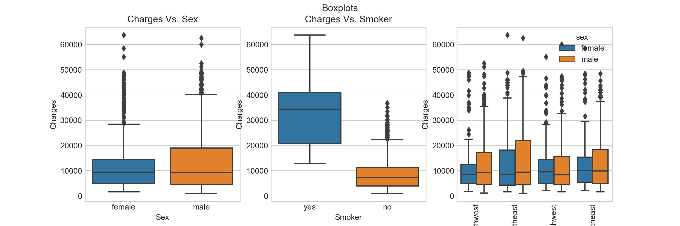
It seems like smoking is an important factor that influences insurance charges. There seems to be high outliers / tails in almost all the boxes.
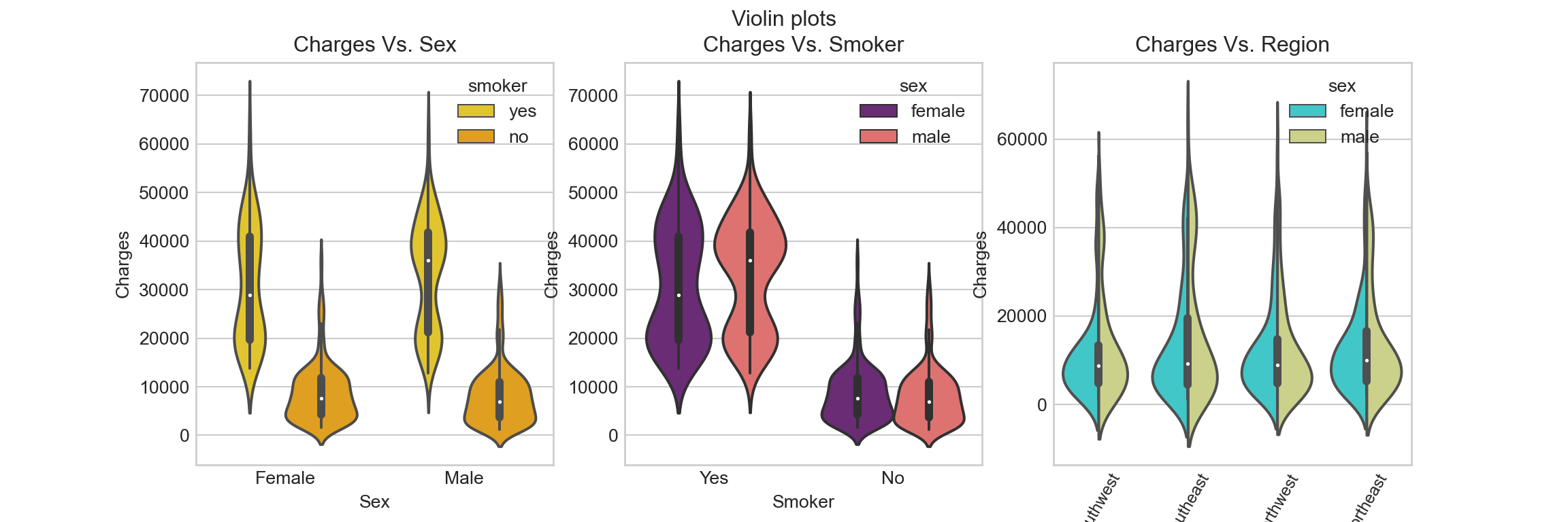
Violin plot shows the distribution of the continuous variable at each categorical variable level:
## Create a blank figure object
f_violin = plt.figure(figsize = (12, 4))
f_violin.suptitle('Violin plots')

## Add axes and plots to three sub-figures

# add figure 1 axes and plot
ax_violin = f_violin.add_subplot(131)
sns.violinplot(x = df.sex, y = df.charges, ax = ax_violin, hue = df.smoker, palette='Wistia')
ax_violin.set_title('Charges Vs. Sex')
ax_violin.set_xlabel('Sex')
ax_violin.set_ylabel('Charges')
ax_violin.set_xticklabels(['Female', 'Male'])

# add figure 2 axes and plot
ax_violin = f_violin.add_subplot(132)
sns.violinplot(x = df.smoker, y = df.charges, ax = ax_violin, hue = df.sex, palette = 'magma')
ax_violin.set_title('Charges Vs. Smoker')
ax_violin.set_xlabel('Smoker')
ax_violin.set_ylabel('Charges')
ax_violin.set_xticklabels(['Yes', 'No'])

# add figure 3 axes and plot
ax_violin = f_violin.add_subplot(133)
sns.violinplot(x = df.region, y = df.charges, ax = ax_violin, palette = 'rainbow', split = True, hue = df.sex)
ax_violin.set_title('Charges Vs. Region')
ax_violin.set_xlabel('Region')
ax_violin.set_ylabel('Charges')

texts = [t.get_text() for t in ax_violin.get_xticklabels()]
ax_violin.set_xticklabels(texts, rotation = 60, size = 9)
- Categorical scatter plots
Now let’s try the strip plot:
## Create a blank figure object
f_strip = plt.figure(figsize = (12, 4))
f_strip.suptitle('Strip plots')

## Add axes and plots to the three sub-figures

# add figure 1 axes and plot
ax_strip = f_strip.add_subplot(131)
sns.stripplot(x = df.sex, y = df.charges, ax = ax_strip)
ax_strip.set_title('Charges Vs. Sex')
ax_strip.set_xlabel('Sex')
ax_strip.set_ylabel('Charges')

# add figure 2 axes and plot
ax_strip = f_strip.add_subplot(132)
sns.stripplot(x = df.smoker, y = df.charges, ax = ax_strip)
ax_strip.set_title('Charges Vs. Smoker')
ax_strip.set_xlabel('Smoker')
ax_strip.set_ylabel('Charges')

# add figure 3 axes and plot
ax_strip = f_strip.add_subplot(133)
sns.stripplot(x = df.region, y = df.charges, ax = ax_strip)
ax_strip.set_title('Charges Vs. Region')
ax_strip.set_xlabel('Region')
ax_strip.set_ylabel('Charges')

# adjust the x tick labels so that they fit in the figure
texts = [t.get_text() for t in ax_strip.get_xticklabels()]
#texts = [textwrap.fill(t.get_text(), 10)  for t in ax_strip.get_xticklabels()]
ax_strip.set_xticklabels(texts, rotation = 60, size = 9)
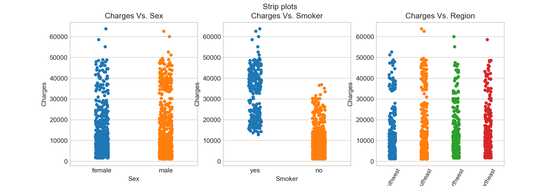
Swarm plot:
## Create a blank figure object
f_swarm = plt.figure(figsize = (12, 4))
f_swarm.suptitle('Swarmplots')

## Add axes and plots to sub-figures

# add axes and plot to figure 1
ax_swarm = f_swarm.add_subplot(131)
sns.swarmplot(x = df.sex, y = df.charges, ax = ax_swarm, size = 2, hue = df.smoker)
ax_swarm.set_title('Charges Vs. Sex')
ax_swarm.set_xticklabels(["Female", "Male"])
ax_swarm.set_xlabel('Sex')
ax_swarm.set_ylabel('Charges')
#ax_swarm.legend(['smoker', 'non-smoker'])
#ax_swarm.legend(loc = 'best')

# add axes and plot to figure 2
ax_swarm = f_swarm.add_subplot(132)
sns.swarmplot(x = df.smoker, y = df.charges, ax = ax_swarm, size = 1.5, hue = df.region)
ax_swarm.set_title('Charges Vs. Smoker')
ax_swarm.set_xticklabels(['Yes', 'No'])
ax_swarm.set_xlabel('Smoker')
ax_swarm.set_ylabel('Charges')

# add axes and plot to figure 3
ax_swarm = f_swarm.add_subplot(133)
sns.swarmplot(x = df.region, y = df.charges, ax = ax_swarm, size = 1.8, hue = df.smoker)
ax_swarm.set_title('Charges Vs. Region')
ax_swarm.set_xlabel('Region')
ax_swarm.set_ylabel('Charges')
texts = [t.get_text() for t in ax_swarm.get_xticklabels()]
ax_swarm.set_xticklabels(texts, rotation = 60)
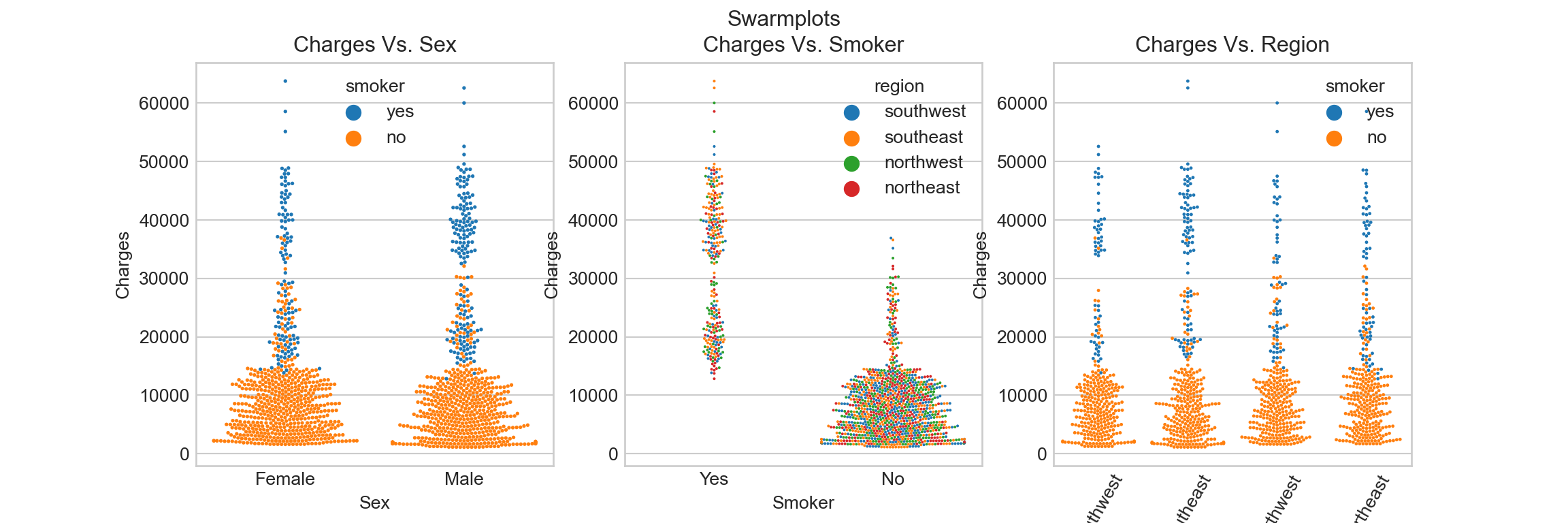
Smoking seems to be a big factor to insurance charges, despite any sex or region levels.
- Posted on:
- January 19, 2022
- Length:
- 7 minute read, 1419 words
- Categories:
- python data visualization EDA Seaborn
- See Also: